Fundamental Library - An open source and community driven project to provide a consistent user interface across web applications.
Fundamental Library

Fundamental Library Styles
Delivers a Fiori 3 component library for building SAP user interfaces with any web technology.

Fundamental Library for Angular
Provides an Angular implementation of the components designed in Fundamental-Styles.

Fundamental Library for React
Offers a React implementation of the components designed in Fundamental Styles.

Fundamental Library for Vue
Supplies a Vue implementation of the components designed in Fundamental Styles.
Key Features

Foundational
Focuses on web standards; basic elements and simple patterns.

Modular
Revolves around self-contained components, while encapsulating styles and behaviours.

Flexible
Encompasses theming capabilities and combines basic blocks to create complex components.

Collaborative
Welcomes multiple contributors within its community and allows for fast release cycles.
More about Fundamental Library
Ensuring a consistent look and feel, while harmonizing multiple products and applications, is a demanding and expensive task. It entails rebuilding them from the ground up and accommodating them to SAP UX standards. The Fundamental Libraries grew out of a need to address just that.
Fundamentals is comprised of a set of libraries that cover the most common UI components, patterns and layouts. It offers a design system and component library that allows teams the flexibility to quickly implement consistent UX with Fiori 3, without needing to change the frontend framework or library.
Fundamentals also tackles accessibility by using the proper semantic html tags such as buttons or anchor tags. By using the right html tag, the browsers cover about 80% of the accessibility requirements and the Fundamental Libraries team aims to cover the rest. Find access to the old version of Fundamentals here.
Design
Want to visualize an application with the SAP Fiori design system? Our UI kit provides users with ready-to-use, state-of-the-art drafts of SAP Fiori layouts, patterns and components in Sketch. They are easy to implement, and will provide you with a realistic impression of your final design. The UI Kit bundle includes:
Sketch UI Kit v0.10.0
Our UI kit is a sketch file with over 30 unique, refined, and streamlined components to empower anyone using Fundamental Library with the ability to quickly and efficiently build SAP Fiori interfaces.

72 Font
SAP’s 72 font family was designed from the ground up to meet SAP's typographic requirements, including: legibility enhancements, font styles, brand voice, character set, language support and accessibility.
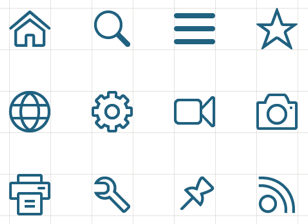
Icon Font
SAP offers their icons in font format to ensure scalability and readability at all sizes. The style is friendly, elegant and consistent. The icons are tailored for simple and direct user interaction, using metaphors that are easy to understand.
The most intuitive and engaging design system for enterprise software
When you design with Fundamental Library, you’re implementing best-in-class SAP Fiori design from the largest enterprise software company in the world.
Learn more
Blog Post
Integrating SAP Apps from a UX POV: About Fundamental Library and UI5 Web Components

Blog Post
Blog Post
Testimonials
Community
Join our vibrant community of developers and help drive the Fundamental Libraries forward! Take part in the conversation via our various channels.


